Transaction Modal: Redesigning the Financial Core to Drive a Strategic OKR
Categories
Confidentiality

Context
In 2025, the company had a clear corporate KR: achieve a positive Net Revenue Churn MRR, meaning revenue from upgrades and expansions would exceed losses, making growth predictable within the existing customer base.
Within that KR, a critical OKR was identified: “Ensure financial functionalities are no longer a competitive disadvantage.”
Historically, the financial module was the main source of negative reviews, detractors, and cancellations on the platform.
Our hypothesis: improving this module would reduce friction that drives churn and increase perceived product value, directly impacting Net Revenue Churn and customer retention.
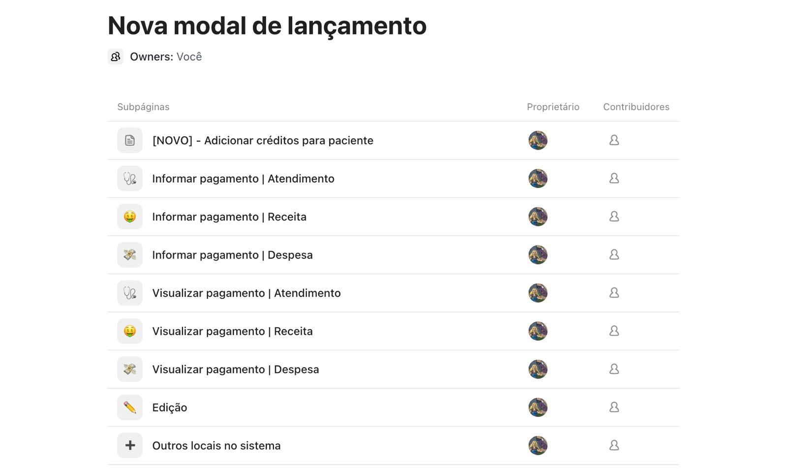
Research revealed the transaction modal as the system’s epicenter, it drives all financial activity. Enhancing it would increase reliability and scalability across the module, laying a solid foundation for future feature evolution in a consistent and sustainable way.
Problem
The old transaction modal had multiple friction points affecting operational efficiency and the accuracy of financial data for clinics.
Key issues included:
- Only discounts could be applied—no support for surcharges, interest, or fines—forcing users to create manual workarounds that distorted reports.
- Clinics with exempt procedures or exchanges had to manually zero values, compromising analysis accuracy.
- Installment control was limited: users couldn’t edit amounts, apply early payment discounts, or add late fees, making bank reconciliation difficult.
- The modal didn’t alert for missing values, leading to errors and open transactions.
- The flow was cumbersome, with many clicks, low traceability, and weak safeguards against inconsistencies.
- Essential clinic management features were missing, such as patient credits, multiple categories per transaction, and cost centers.
These limitations reduced operational efficiency, generated recurring support tickets, and lowered perceived software value compared to competitors.
Objective
Redesign the transaction modal to create a workflow that is:
- Flexible (supports surcharges, exemptions, credits)
- Reliable (alerts, edit history)
- Efficient (fewer clicks, inline editing)
- Reduces support tickets and increases perceived value, contributing to positive Net Revenue Churn.

Process
Based on insights from prior research, we began redesigning the transaction modal, prioritizing speed without compromising quality.
We skipped wireframes and went straight to high-fidelity Figma prototypes, leveraging our mature Design System with established components and visual patterns.
This accelerated the process and allowed us to focus on interaction architecture and business rules, which were critical given the modal’s system-wide impact.
We conducted moderated usability tests with real users to validate the new workflow and identify improvements before development.
Key insights included:
- Expand input fields for surcharges and discounts for better readability of large amounts.
- Add a confirmation button when applying adjustments.
- Automatically display open balances when adding new payment methods.
- Simplify credit entry with a dedicated button on the patient profile and clarify labels (“+Credit” instead of “+Revenue”).
- Add supplier fields and allow category creation directly in the modal.
Using these learnings, we refined the design and proceeded to development with comprehensive business rule documentation, a crucial factor for technical success.
Because the feature interacts with almost the entire system, the handoff required high-detail documentation. I led the rule definitions, ensuring clarity across design, product, and engineering.

Solution
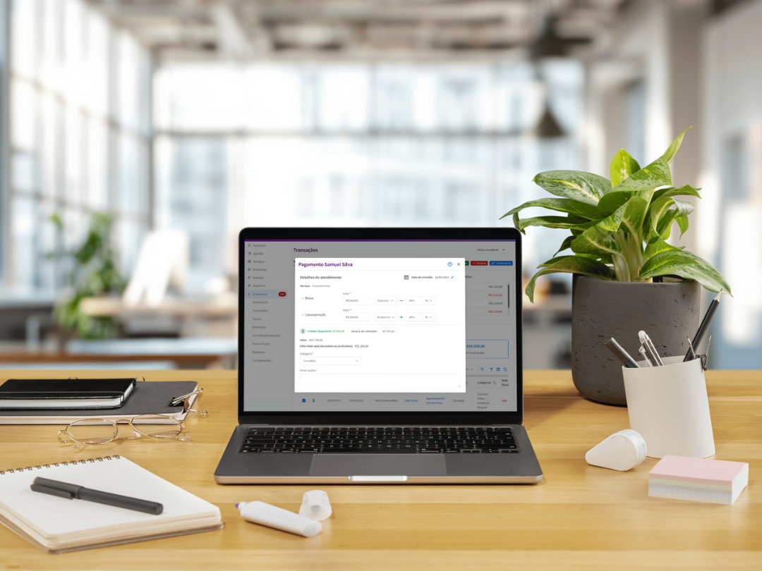
The redesigned modal introduced an intelligent, secure, and context-aware structure for financial workflows, focusing on flexibility and error reduction.
Major improvements:
- Cleaner, faster interface: Navigation is lighter, intuitive, and more responsive, creating a smoother, more productive experience.
- Custom surcharges and discounts: Users can now add interest, fines, or one-time discounts directly in transactions, ensuring financial accuracy.

- Exempt payments: Easily mark payments that don’t need to be collected, like insurance-covered or free-of-charge services, without affecting reports.
.gif)
- Flexible installments: Each installment can be individually adjusted to reflect renegotiations or specific corrections.

- Quick payment edits: Users can modify key information, like amount or date, directly on the transaction screen.
- Clear date labeling: Renamed date fields to clarify transaction cycles.
- Patient credits: Surplus payments can now be stored as patient credits for future services.
- Full edit history: All changes are logged, providing transparency, traceability, and enhanced security.

These enhancements made financial management more flexible, secure, and aligned with real clinic workflows.
The rollout used feature flags, gradually releasing the modal to small user groups, reducing bug risk and allowing fast adjustments. This strategy became the company’s new standard for feature launches.
Metrics
We defined success metrics across three pillars: adoption, behavior, and business impact.
1) Adoption
- % of users accessing the new modal
- % of users abandoning the workflow mid-action
- % accessing via onboarding tour
- Onboarding completion rate
2) Behavior
- Average time to complete a transaction
- Error events or invalid actions
3) Business impact
- Reduced support tickets and bug reports
- Faster resolution of financial errors
- Revenue generated by upgrades triggered by the new modal
Results
15 days post-launch:
- 140k+ accesses
- 115k+ completed transactions
- >80% conversion from open to complete transactions
Consistent use of new fields (surcharges, credits, exempt transactions) confirmed alignment with real workflows. Users quickly incorporated the functionality into daily routines, validating it as a high-value technical and business delivery for the financial module OKR.
Qualitative feedback highlighted impact on user experience:
“It’s clear attention was paid to the details and customer workflow. The biggest improvement is ease of use—what used to take so many steps is now simple.”
“Screens have more info but feel much cleaner and more organized, plus they look great!”
“Tools like exempt payments and editable payment history make me wonder how we managed without them before.”
Learnings & Next Steps
Redesigning the transaction modal was a complex project requiring cross-functional integration and technical rigor.
Key takeaways:
- A reliable financial system starts at the data source: Clarity and flexibility at the origin directly impact perceived product value.
- Documentation is a product: Clear rules and documentation prevent rework and bugs.
- Smart rollout matters: Feature flags enable safe releases, continuous learning, and low risk.
- The power of the “invisible”: Technical improvements like history and traceability significantly boost user confidence and perceived value.
Next steps:
- Extend interaction patterns and traceability from this modal across all financial areas, ensuring consistency and scalability throughout the module.