Bifröst Design System
Team
![[headshot] image of customer (for a construction company)](https://cdn.prod.website-files.com/68ee8a9eda53f396ff5991e6/6901137fc2933c31ce20643b_Ale.jpeg)
![[headshot] image of customer (for a construction company)](https://cdn.prod.website-files.com/68ee8a9eda53f396ff5991e6/690115cd4863ee8167cd9fa7_Luan.jpeg)
![[headshot] image of customer (for a construction company)](https://cdn.prod.website-files.com/68ee8a9eda53f396ff5991e6/68f139a9ca9d400cfba12295_unnamed%20(1)%20(1).jpg)
Categories
Confidentiality Notice
Context & Challenge
Over the years, the product had evolved into a complex ecosystem, with multiple teams contributing to its growth. Without a structured Design System, every designer and developer created components their own way, leading to a fragmented experience, visual inconsistencies, and constant rework.
Buttons, inputs, and icons were duplicated and implemented differently, with inconsistent behavior and no alignment between design and code. This lack of standardization directly affected team efficiency and user experience.
Our challenge was clear: build a Design System from scratch in an eight-year-old company, respecting the existing legacy while engaging multiple teams to create something everyone would actually adopt.
Step 1: Selling the Idea
Before prototyping, we had to get buy-in from the team. We presented the concept of a Design System in an educational way, sharing numbers, success stories, and benchmark examples to show real impact on speed and consistency.
From the start, we made a point to involve engineers and developers in the discussion to demonstrate that this project wasn’t just about design, it was about efficiency and cross-team collaboration.
We held a dedicated meeting to align expectations and show that the Design System would be a living, evolving, and collective product.
As Robert N. Charette notes, programmers spend an estimated 50% of their time on rework, time that could be avoided.
Step 2: Research & References
The beginning was full of uncertainties. Every Design System is unique and should reflect the product’s culture and context.
We started with intensive desk research, studying page builders and companies that had documented their own Design System processes.
Articles, videos, and webinars were shared with the team to build a common knowledge base. Slowly, the pieces started falling into place: we realized that beyond components, we needed clear principles and processes.
Step 3: Inventory & Diagnosis
Before creating something new, we needed to understand what already existed.
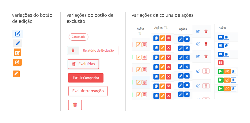
We conducted a full component inventory, mapping every variation of buttons, inputs, typography, and layout patterns used in the interface.
We analyzed:
- Component structure
- Differences between prototypes and production
- Accessibility issues and color contrast
The inventory revealed the magnitude of the challenge: dozens of unnecessary variations and broken patterns.
Step 4: Principles & Guidelines
Next, we defined design principles to ensure the system reflected the values we believe are essential for building digital products:
- Consistency: Ensure a unified visual and code language
- Collaboration: Promote a process where design and engineering evolve together
- Usability: Create intuitive, accessible interfaces
- Scalability: Allow the system to grow without losing coherence
- Inclusive Language: Communicate clearly and respectfully
Alongside the principles, we created an accessibility guide and defined best practices for documentation, grids, spacing, and color usage.
With the diagnosis complete and principles defined, we started building components. Documentation became key: each new element was recorded with purpose, usage rules, variations, and best practices.
The Design System 🌈

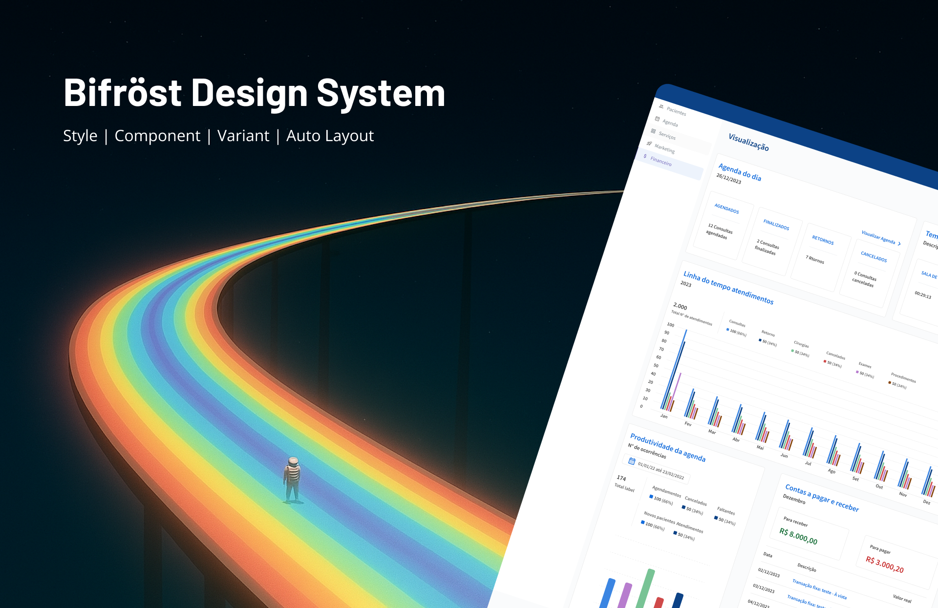
Like the Bifröst bridge connects worlds in Norse mythology, the Bifröst Design System bridges design and development, uniting different realms into a single harmonious structure. Inspired by the bridge symbolizing the passage between the earthly and the divine, Bifröst DS transforms product complexity into visual clarity and consistency.
It serves as a solid bridge, guiding designers and developers in creating cohesive, scalable experiences. The name Bifröst was chosen to align with the Viking theme in the company’s culture.
Colors
Colors were categorized into primary, secondary, and context-specific palettes (tags, alerts, success states, etc.). We removed combinations that failed WCAG accessibility tests and defined variations for component states such as hover, active, and disabled to ensure consistency and usability.

Typography
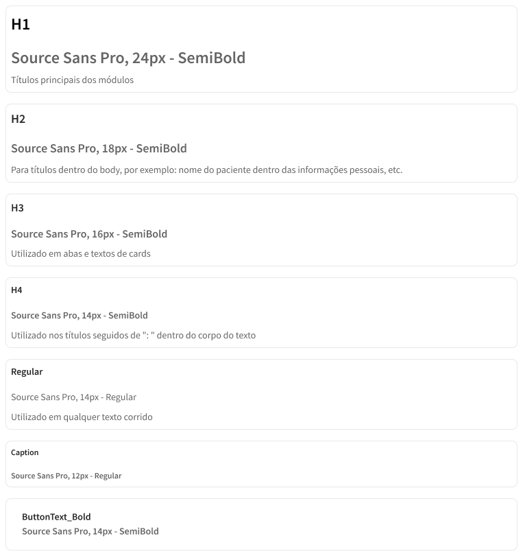
Standardized font sizes for headings, subheadings, body text, and other components. We established a typographic hierarchy with styles for different information levels, including spacing and alignment guidelines.
Icons
We used Google’s Material Design icon family for their recognizable, simplified design and similarity to the icons already in the system.
Buttons
Buttons were designed with fill, outline, and text variations, and in two sizes (32px and 22px) for different contexts. States like active, inactive, and hover were defined, with practical usage examples for various scenarios.
.gif)
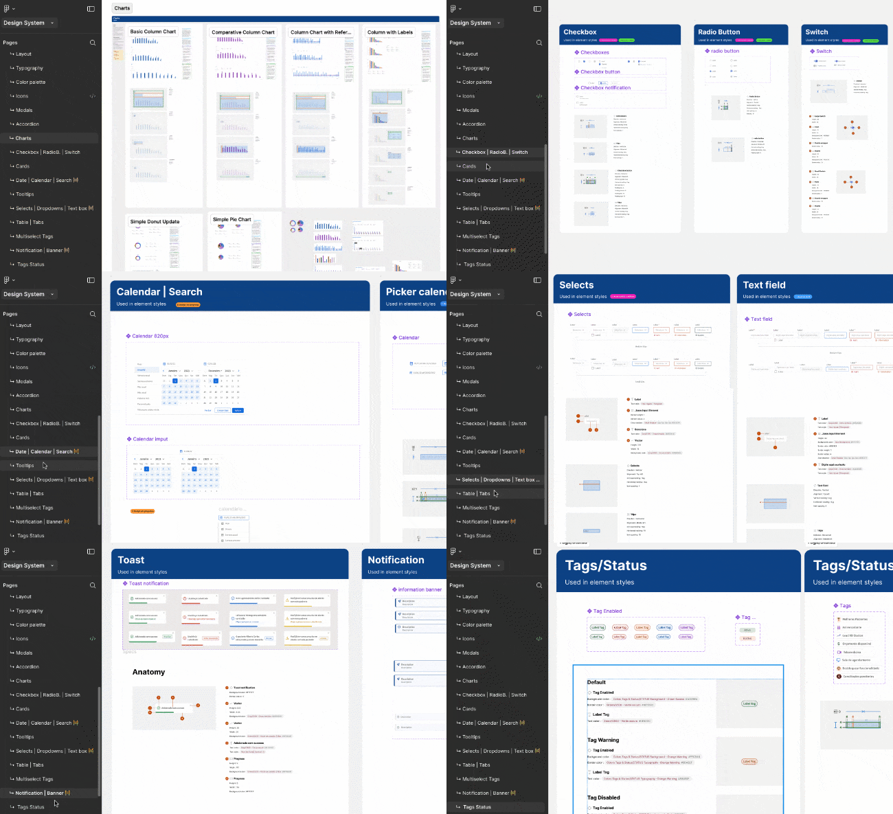
Other components created
- Grids, spacing, and templates;
- Tooltips;
- Tags, checkboxes, radio buttons, switches, selects, dropdowns, text boxes;
- Tables, multiselects, accordions, transfer lists, uploads;
- Loading indicators, scrollbars, counters, slideshows;
- Date pickers, calendars, search components;
- Cards, charts;
Step 6: Validation & Iteration
After the first version, we ran validation sessions with designers and developers to test adoption and identify improvement points. These sessions were essential for refining naming conventions, reviewing tokens, and streamlining version control.
From there, we established a continuous evolution process: components are reviewed weekly, new patterns are added, and the system is always up to date.
Today, the Design System functions as a living organism, growing alongside the product.
Results & Key Learnings
Building a Design System goes far beyond assembling components in Figma.
Results:
- Faster delivery, with significant reductions in design and development time
- Real consistency across different product areas
- Increased team engagement, with active contributions to the system’s evolution
But the biggest lesson was human: a Design System only works when people believe in it.
We continue to refine this system with the same purpose that drove us from the start: creating a solid foundation for everyone to build better products, together.